Artificial intelligence, along with the immense amounts of data collected by businesses and government agencies, can be used to map out social inequality. This “Community Vulnerability Index” dashboard is being patented by the Parkland Center for Clinical Innovation (PCCI), a healthcare research nonprofit in Dallas.
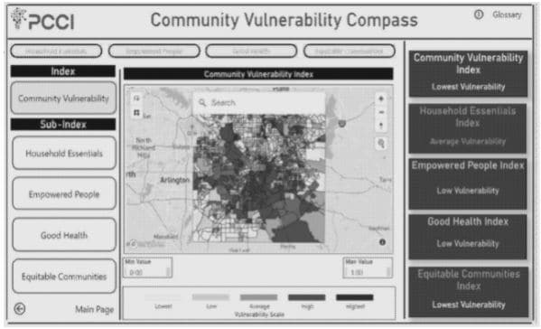
Fig. 1. An exemplary landing page for the community vulnerability dashboard.
A 2019 survey by the Pew Research Center showed that roughly 6 in 10 U.S. adults do not think it is possible to go through daily life without having companies or the government collecting their data. The overextension of powerful entities into people’s private lives has been a hot topic in the 21st century. As the world becomes ever more interconnected, tensions are set to rise as agendas for both data collection and data privacy gain ground.
Countless organizations across the world build their money and influence on personal information, and asking them to pump the brakes on a technological gold rush arguably still in its infancy is admittedly the tallest of orders. PCCI suggests a way to derive value from a staple yet controversial aspect of modern life—value that could benefit the public at large.
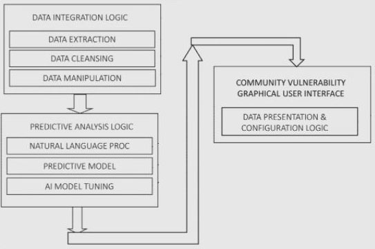
Fig. 2. A flow diagram of an embodiment of the community vulnerability index dashboard according to PCCI’s patent application.
The community vulnerability index dashboard operates on at least four components: a data ingestion logic module, a data processing module, a data analysis logic module, and a data presentation dashboard interface.
The data ingestion logic module is configured to automatically and periodically receive real-time and non-real-time data from a variety of sources. These are selected from a group comprising agencies in education, law enforcement, health services, healthcare, medical insurance, housing, transportation, child care licensing, and non-emergency citywide services.
PCCI notes the huge volumes of data generated on a regular basis. It says that unfortunately, most existing data discovery platforms are either too broad or too narrow in their scope, and fall short of providing actionable data needed by various entities to affect significant change. Through the aggregation of high-quality data from a variety of sources, the dashboard may produce accurate, multifaceted insights.
But first, the data processing module “cleans” or pre-processes the disparate bits of collected information. It renders them into a standardized format and prepares unstructured text for natural language processing (NLP) under the data analysis logic module.
During NLP, raw unstructured text is tokenized: divided into basic units of information in the form of single words or short phrases. The system quantifies the relationship and frequency of word and phrase patterns and processes them using statistical algorithms. Machine learning is used to develop inferences based on repeated patterns and relationships.
Meanwhile, predictive analysis is used to analyze the data and predict occurrence risks for particular conditions of interest. PCCI’s exemplary embodiment of the dashboard classifies insights under the following indicators:
- Household essentials, covering food insecurity, paycheck predictability, household structure, health insurance coverage, and median income.
- Personal empowerment, covering educational attainment, internet connectivity, literacy, walkability, bike accessibility, and transit availability.
- Equitable communities, covering employment, affordable housing, neighborhood safety, neighborhood stability, clean air, and green space.
- Health, covering life expectancy, alcohol abuse, disease burden, and mental health.
The data presentation dashboard interface simply displays generated values under the different indicators along with an overall community vulnerability index, perhaps through interactive choropleth maps, which employ various shading patterns or symbols on predetermined geographic areas to visualize and compare geospatial statistics. PCCI says the dashboard may be accessed through mobile phones, tablets, laptops, and desktops, among other computing devices.
The featured patent application, “Community Vulnerability Index Dashboard”, was filed with the USPTO on March 3, 2021 and published thereafter on September 9, 2021. The listed applicant is Parkland Center for Clinical Innovation. The listed inventors are Akshay Arora, Venkatraghavan Sundaram, Lindsay Zimmerman, Thomas Roderick, Esther Olsen, Leslie Wainwright, Vikas Chowdhry, Steve Miff, Aida Kreho Somun, Vency Varghese.